Brand Identity, Design System, Packaging & Technology
Wellness
Our friends at Grounded swung by seeking branding expertise. We dove in, crafting an irresistible brand identity, designing eye-catching packaging, and constructing an e-commerce site. Our tech consultation further fine-tuned their setup. It's not just about business growth; it's about fortifying our neighborhood bond.
When we asked Jenn from Grounded about the origin of the name, she shared a delightful anecdote. Her former Romanian instructor used to gently nudge her unexpectedly, teaching her the importance of balance and staying grounded. Jenn wanted to carry that lesson forward in her life. To be grounded is to be fully present, and to achieve that, self-care is paramount.


To emphasize this concept, we decided to incorporate the alchemical earth symbol. Earth is often seen as a symbol of stability and support, reinforcing the idea of being grounded. We’ve added our own minor edits to the symbol by adding negative space.


Each sub-brand was carefully crafted to maintain coherence with the overarching identity while adapting to different products and services. This approach not only highlights their versatility but also ensures consistency across their diverse offerings, fostering brand recognition and loyalty.

Drawing from nature's charm, we handpicked minimalistic fonts that dance in harmony with our brand's essence. These typefaces, imbued with simplicity and natural grace, weave seamlessly into our visual tapestry. By embracing these fonts, we've infused our brand with an earthy elegance, creating a cohesive and soulful connection.

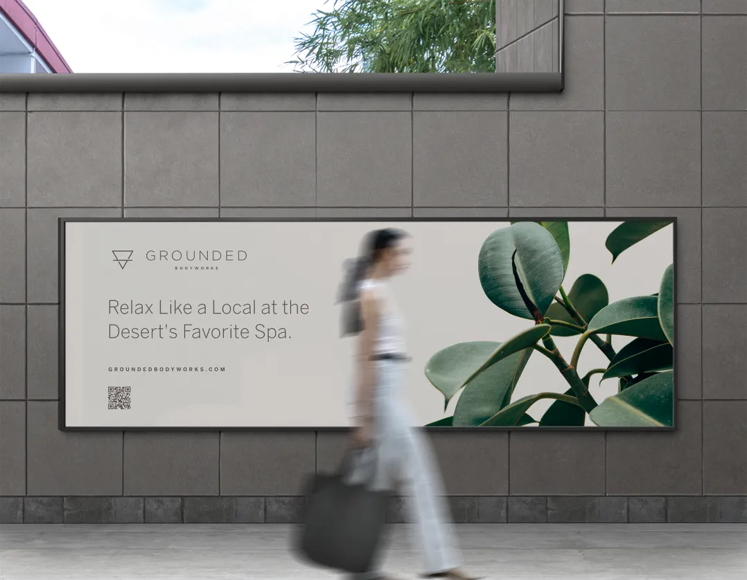
Inspired by nature's tranquility, our warm, relaxing color palette mirrors the sun-kissed sands and earthy greens of olive groves. These hues evoke a sense of calmness while reflecting our brand's connection to the natural world. By infusing our palette with these organic tones, we create a visual experience that resonates with our audience, inviting them to embrace the soothing essence of our brand.

Our aim was to infuse the brand with a minimalist vibe, achieved through warm, natural tones and clean, simple fonts. We incorporated images of plants and natural elements to evoke a sense of calmness and connection to nature. This visual essence not only reflects the brand's tranquil identity but also resonates with their audience, creating a cohesive and inviting brand experience.

Our design process for these bathroom essentials labels is deeply rooted in reflecting the essence of this spa. We carefully chose earthy tones and organic visuals such as the plants that surround Grounded, to mirror the spa’s tranquil vibe. We wanted scalability of the brand to travel further than website and storefronts.
We're not just about design; we're all about sharing wisdom and vibes. From sourcing booking software tailored to her needs to offering growth strategies, our guidance has been instrumental in her business journey. By helping her navigate these crucial decisions, we've not only streamlined operations but also paved the path for sustainable growth.


We've built a website from scratch, equipped with e-commerce capabilities, ensuring our friend's business thrives beyond traditional hours. Now, they can make sales around the clock and extend their reach far beyond our neighborhood's borders


See why business owners believe Konsist is the team they were missing!


